
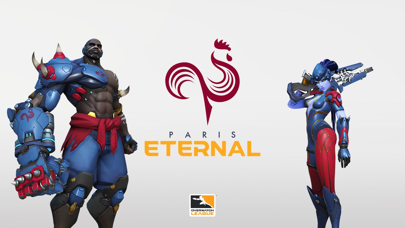
Three more Overwatch League expansion teams have unveiled their team names, colors and logos over the past few days, joining the Atlanta Reign and the Toronto Defiant. The first to announce was the Paris Eternal. The Eternal logo features an infinity symbol within the body of a rooster. While this may seem a little strange to adopt as a logo, the rooster is not just any old chicken; according to the press release, the logo features a “Gallic rooster, long the national symbol of France.” While at first glance seems a little silly, the meaning behind the brand and logo makes sense for the new club. The colors of the team will be blue, burgundy, white, and gold.

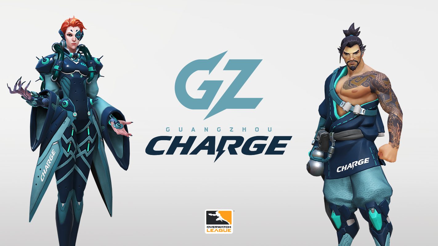
Announcing just a day later was the Guangzhou Charge. The Charge will feature a light blue, dark blue, and green color palette. The logo chosen is an electrified G and Z for the domain in which it represents, with the name “Charge” holding a deeper meaning for the city. Mr. Zhong Naixiong, Executive Chairman of the team owner Nenking Group, said in the press release, “We are the first esports team to represent Guangzhou, and we want to express the spirit of our city and our team as first to lead the charge into a bright future.”

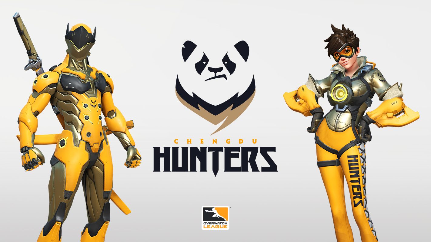
Rounding out the trifecta of exciting team announcements is the Chengdu Hunters. Like the Eternal, the Hunters have elected to use the symbol of its city as the logo, which in this case is a giant panda, “the national treasure of China, the symbol of Chengdu, and a symbol of peace and good luck,” according to the press release. The colors chosen were orange, gold and black, representing a king-like appearance in conjunction with the regal depiction of the panda.

The new Overwatch League season begins on February 14, 2019 and three expansion teams have yet to announce their handles and color schemes: Hangzhou, Vancouver, and Washington D.C. Keep an eye out for the announcements in the future via the Overwatch League newsreel.
Play games, take surveys and take advantage of special offers to help support mxdwn. Every dollar helps keep the content you love coming every single day.
