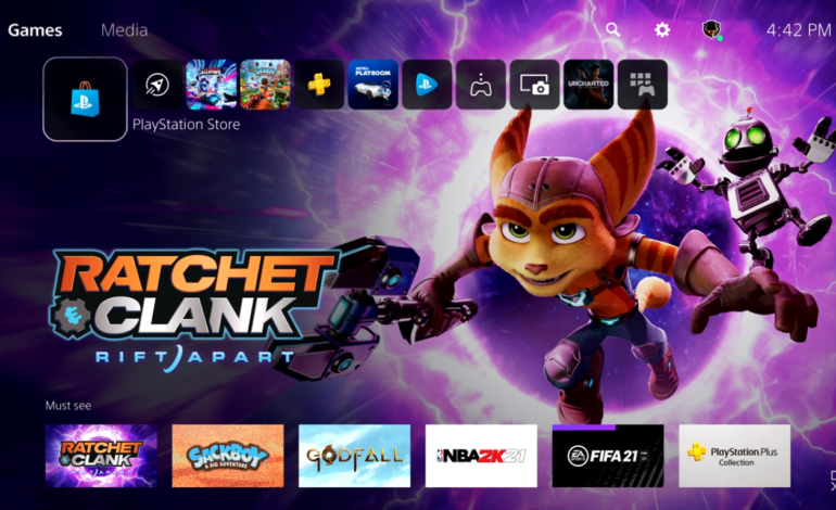

Today, Sony showcased a small snippet of the user interface and user experience for the PlayStation 5. We’ve got some ideas of what it was going to look like through teases, leaks, and patents but this is the first time that anything has been shown for everyone to see. Over on the PlayStation Blog, Hideaki Nishino, Senior Vice President, Platform Planning & Management said “the new UX is completely centered on the player – to provide you a truly next-generation experience with deeper immersion that quickly connects you to great games and a passionate gaming community. We believe your playtime is valuable and should be meaningful, and all the new features we’re delivering are inspired by that concept and vision. The new UX introduces several new features designed to make your gaming experiences more fun, engaging, personalized and social.”
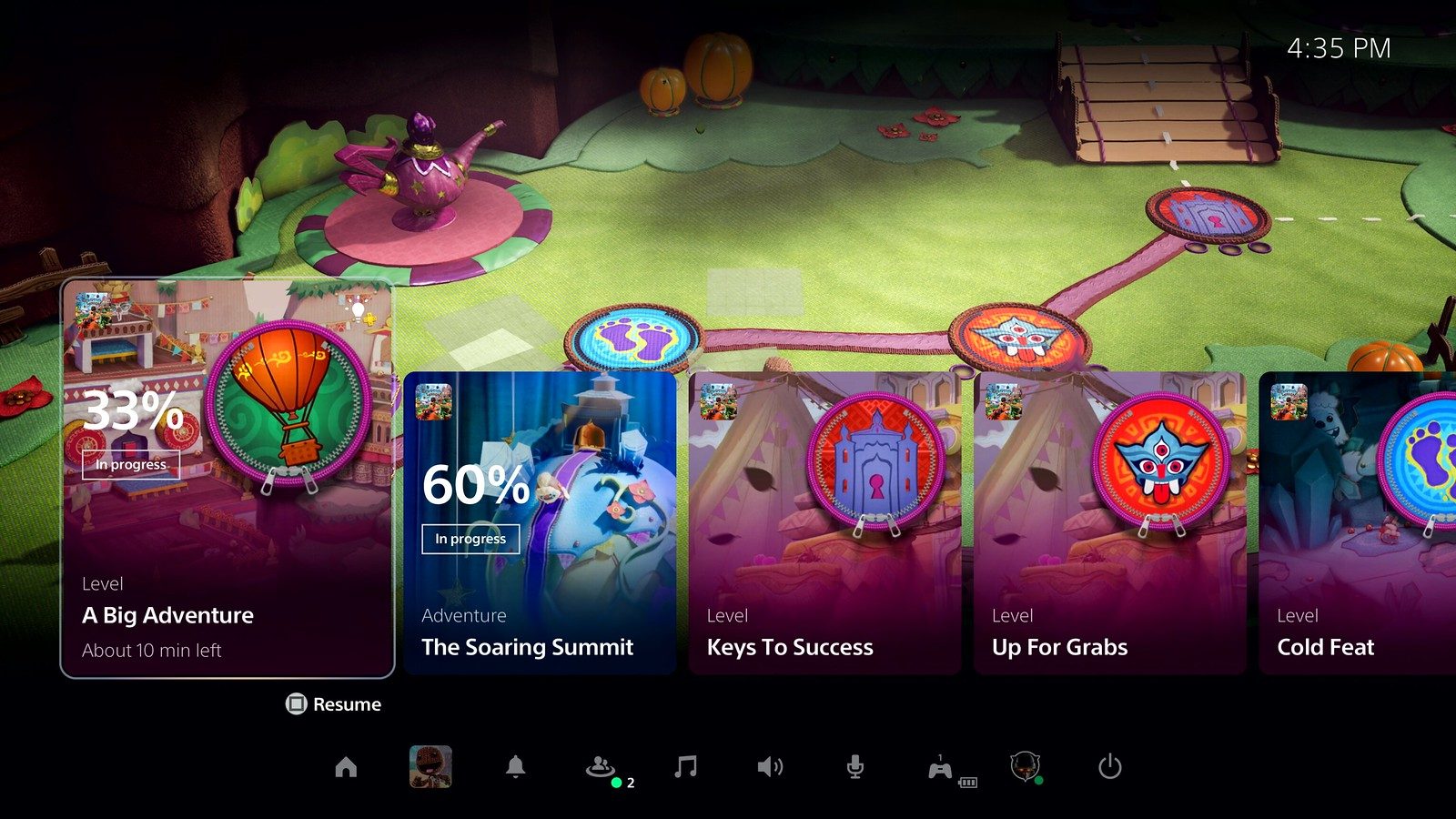
The reveal mainly focused on two new features for the PlayStation 5 UX, the Control Center and Activities. The Control Center provides immediate access to everything you need from the system with a single press of the PlayStation button on the DualSense wireless controller. Think of it as PlayStation 5’s version of the Quick Access menu that you can bring up on PlayStation 4. As you bring up the Control Center, you’ll see the different Activities associated with the game you’re playing. Activities are displayed via on-screen cards and enable you to discover new gameplay opportunities, go back to things you missed, jump directly into levels and challenges you want to play, and more. Some Activities cards can be put in picture-in-picture mode, so they can be viewed without having to leave the game.

“Navigating the interface, switching between games, and hopping into online matches occurs quickly, as we rebuilt the entire software stack from the console to the network to bring you a truly next-generation experience,” Nishino said. “We believe the less time you spend waiting to interact with the system, the more time you will have to spend playing games.”
Play games, take surveys and take advantage of special offers to help support mxdwn. Every dollar helps keep the content you love coming every single day.

