
Recently, KSV eSports, company owner of Seoul Dynasty of the Overwatch League and previous League of Legends world champions, Samsung Galaxy, rebranded to the new organization, Gen.G eSports. After a couple weeks of settling into their new skin, COO of Gen.G eSports, Kent Wakeford, took the time to speak with mxdwn Games about the recent change in branding.
mxdwn: When it comes to rebranding an entire organization, how difficult is it to get everything in motion to do so?
Wakeford: Branding is not easy. But it can be a fun and exciting process.
Since we started the company, we knew we were going to rebrand the name and logo of KSV. That project was quickly delayed as we secured the rights to the Seoul franchise for the Overwatch League and needed to come up with an awesome name and logo for that team before the start of the season. After quite a bit of research and creative design, we developed the name (Seoul Dynasty), the logo (Tiger), color scheme (Black and Gold), and our philosophy for running the team and operations — to be the gold standard of esports. That philosophy has continued to shape our culture and teams. The gold standard was the guiding principle as we developed the Gen.G brand. We had a lot of fun working together to come up with Generation Gaming, then Gen.G, then the logo.
mxdwn: How did your players respond to this type or organizational rebranding? Was there anything special that they had to do as a result of the rebranding?
Wakeford: The players have been incredibly supportive. We set up a series of photo shoots and videos with the players announcing the new logo. We all had fun with the photo shoots.
mxdwn: Now that you have a hand in three of the biggest esports regions (China, USA, S. Korea), are there any other regions you have your eyes on at the moment?
Wakeford: Our focus is to continue to grow and develop our operations in China, S. Korea and the United States. These three regions represent the largest markets for esports. There is so much opportunity in these markets that we will be focused for a while.
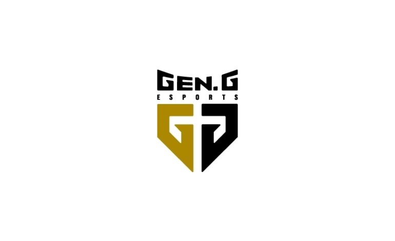
mxdwn: What is the symbolism behind Gen.G’s new logo?
Wakeford: The logo features elements of the core roles of many esport games. There’s a shield to represent “tank” players and then a sword in the middle of the shield to represent “DPS” players. The whole logo is also in the shape of a heart to represent “support” players. And finally, the logo’s two letters read GG – reflecting “good game.”
The primary color we chose for the logo is gold, which reflects our core philosophy for our organization and teams – to be the “gold standard” for esports. We want to set a high bar for bringing together championship players, the best in class coaching staffs, services for the players like nutritionists and financial counseling, and strong marketing expertise to connect players with fans around the world.
mxdwn: With a fresh start with the rebranding, are there any specific esports games or communities that you hope to get into by branding yourself through sponsorships or signing teams/players?
Wakeford: Along with the Gen.G announcement, we also announced our new Clash Royale team in China. We have been big fans of Supercell since the early days of the company and are now excited to playing in its league.
mxdwn: Is there anything exciting that is coming up that you can share with us?
Wakeford: You will see a whole bunch of news coming from Gen.G. The best way to keep updated with Gen.G news is to follow us on Twitter or check out our website.
Play games, take surveys and take advantage of special offers to help support mxdwn.
Every dollar helps keep the content you love coming every single day.

